The best creative web design for clients all have one thing in common; image quality. Images are the number one visual way information is communicated and in the day and age of increasing demands for quick information, images do a great job at telling a story quickly for site visitors. Images are crucial for efficient web design because they break up content on pages which can be overwhelming for visitors. Essentially, people want information fast, and when they don’t get the answer to a search phrase, they leave the site (contributing to high bounce rates, low conversions, and lowered SEO scores). What better way to convey information quickly than through pertinent images paired with good keyword-heavy content aiming to match a visitor’s search phrase?
Efficient use of images can be hugely beneficial to a site and can add to a business’s branding, their tone toward visitors, their business’s image, efficiency in converting visitors, guiding efficient site-navigation, SEO, and much more. Images work hand in hand with creative web design and are increasingly recognized in their importance in conveying information:
“A common finding is an observed processing superiority of pictures as compared to words, suggesting that pictures have a faster and more direct access to meaning, while words are discussed to require additional translational activity...” -Schlochtermeier, et al. (2013).
Given the importance of images to visitors, it is good to know what constitutes as good images for a website to make the most of creative web design.
When people think of the best web design they typically only think of a site’s layout. However, most people forget that a large portion of layout is where to place high-quality images and content. The best web design is unique for each client and their business. However, there are similarities with site layouts and how images are arranged:
Simple and effective designs use layouts with images that do not confuse visitors, help them navigate the site, sell your unique message, and help convert visitors into a customers. Good layouts also use images to guide visitors toward pertinent pages or locations on their site.
There is a misconception that images need to be small for a website. Images need to be as big as possible to get high resolution, only their file sizes need to be small. Thankfully OCG takes care of all file compression so even if you give us massive photos, we ensure they are optimized on your website. Images that are too small are 'pixelated' or 'low-res' and look bad on websites and can hurt your online appearance and brand identity.

High Res Image

Low Res Image
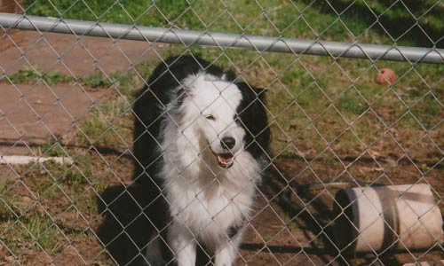
The images need to be well lit. Avoid using a flash because it tends to wash out all images. The main source of lighting should not be behind the subject either and you should avoid highly contrasted images that add a lot of distracting patterns. This is very important because many images on a website have text over them and high-contrast images make it difficult to read the content and can be strenuous to look at on their own.
Good Lighting
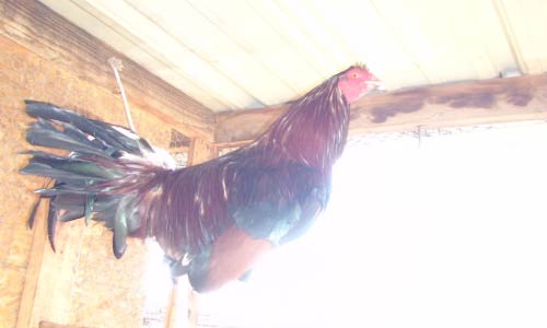
Bad Lighting
Having everything in focus can make the image too cluttered and distract from what you really want to viewer to see in the image. A ‘soft-focus’ pulls the viewer’s eye toward the object you want site visitors to pay attention to while softly blurring the rest. This can also help de-clutter busy images.
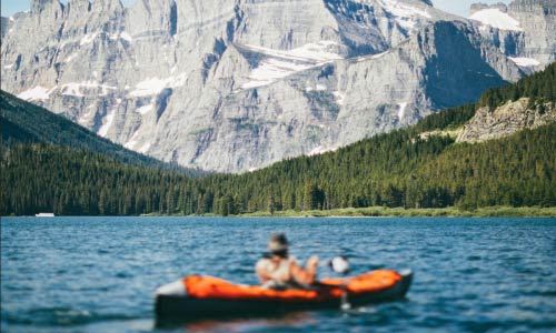
Good Focus
Bad Focus
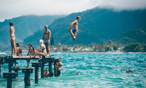
Many people think that if you want to draw attention to something it needs to be centered in the image. That can get repetitive with many images on your site. Take images from close up and far away with the subject in different places. It can be a mistake to take all of your images from one perspective using one composition, unless you are taking product shots.

Good Composition
Bad Composition
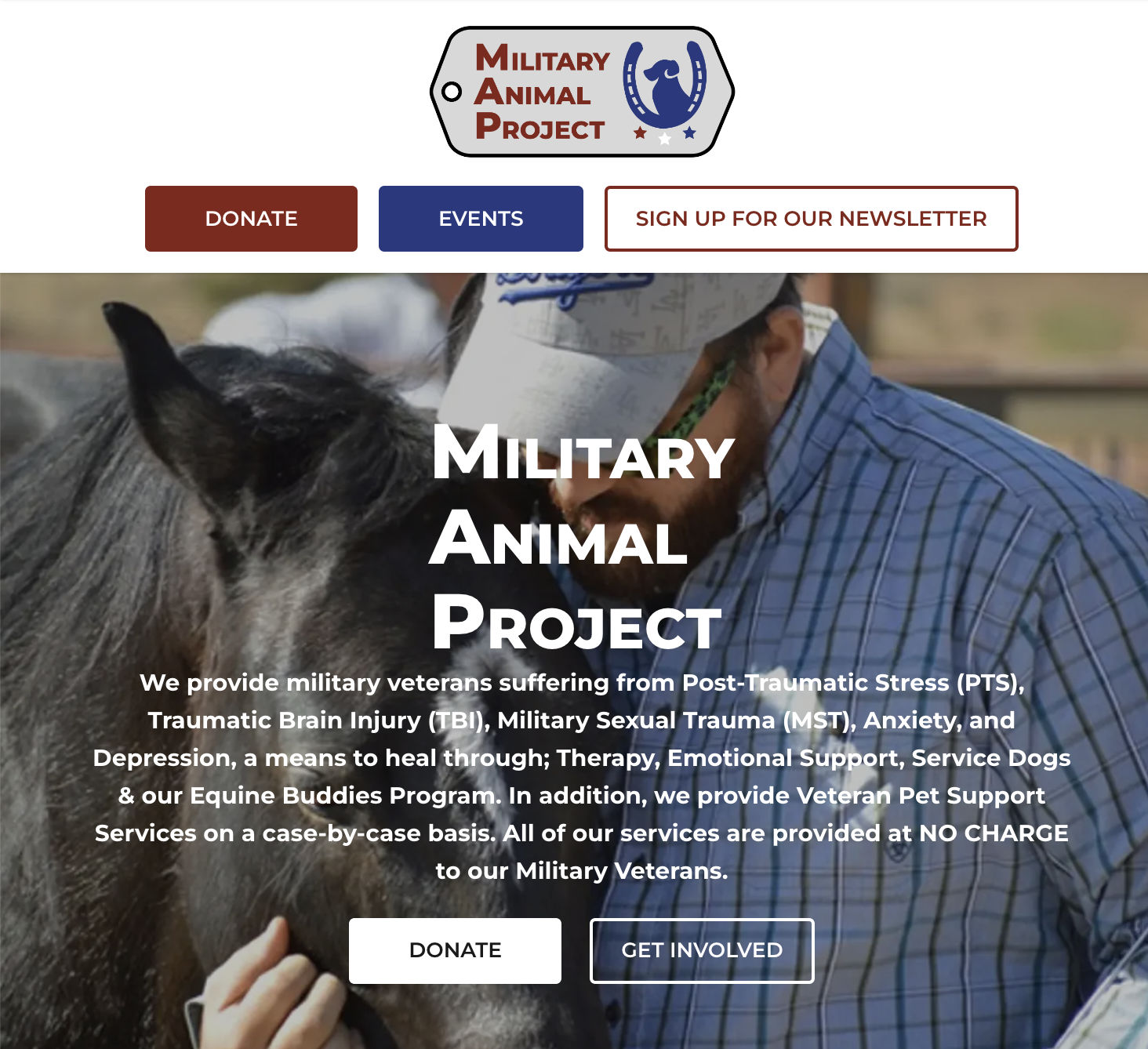
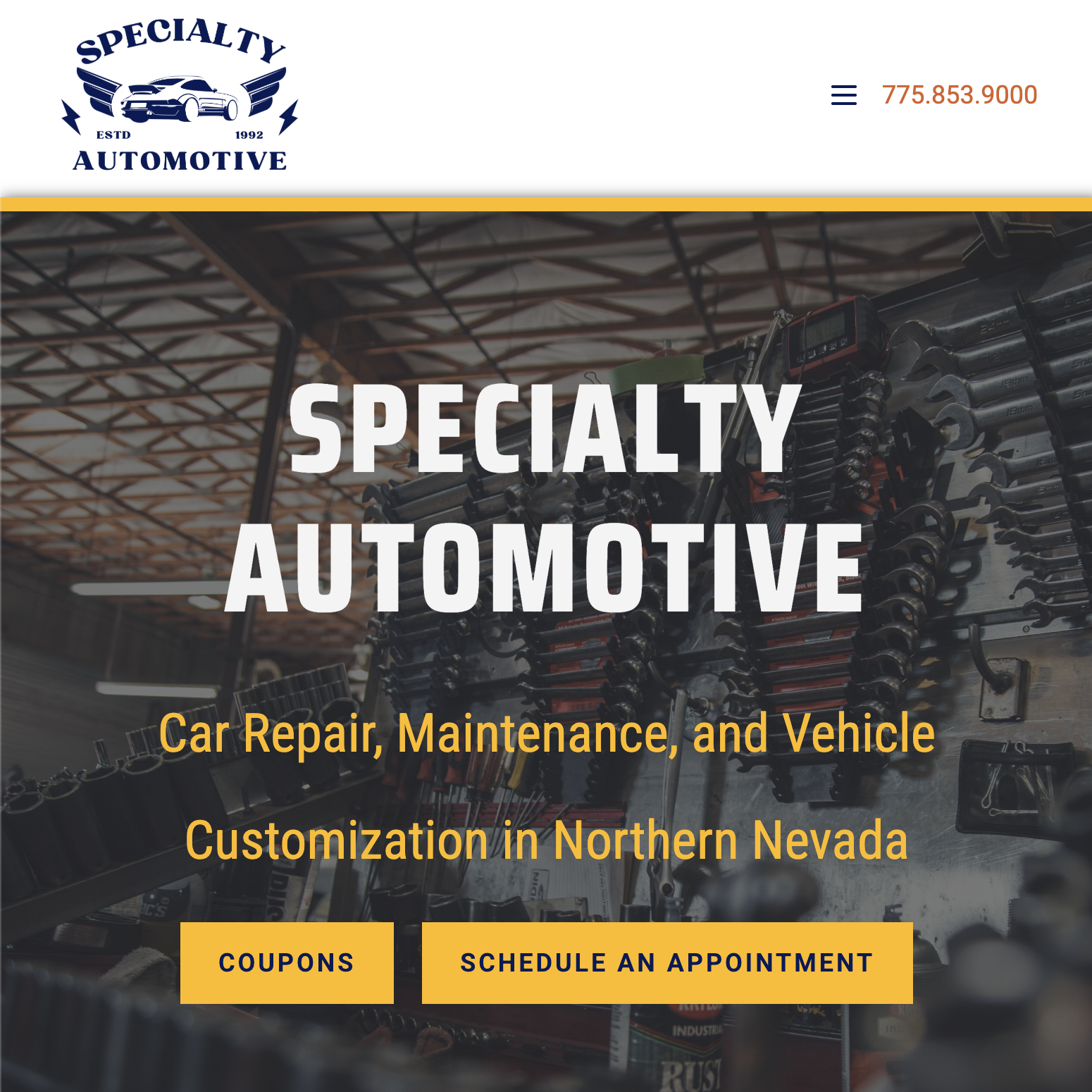
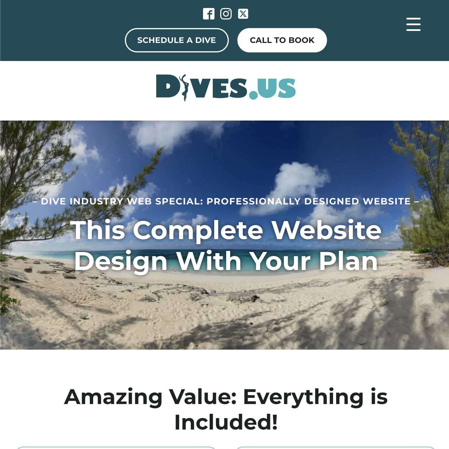
You may hear web-designers or account-coordinators talking about ‘mastheads’. Mastheads, banners, or site headers are the images that display at the top of each web page. These images need to be large (to work with a responsive website) and need to be ‘landscape’ not ‘portrait’. Additionally, because visitors only see a tiny part of the whole image, it is a good idea for the image to capture 'depth’. For example, instead of taking images from a top-down angle on a subject, try taking shots from different angles that emphasize perspective. A good way to do this is taking a series of images starting from the ground-level and moving up.

Good Perspective

Bad Perspective
Many clients find sites and ask what we can do to make their site more like the example they choose. The most common site people tend to ask for is Apple or other sites for technology companies. So what do they do that makes their layout work so well?