![]()
Picking colors may seem like an easy chore that can be done in five seconds, right? Wrong, picking a great and impactful color scheme requires some planning and thought to how well the colors work together.
“Colors must fit together as pieces in a puzzle or cogs in a wheel.” - Hans Hofmann
To help you with your own palette, I've put together examples of website color schemes, to take for inspiration, as well as a few things to think about when you go to pick your website's color scheme.
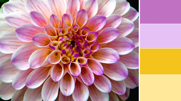
Using warm colors with cooler ones will create a complimentary color scheme that is bound to impress viewers whether you choose a deep blue and bright orange, or a dark purple and vibrant yellow. Something to write down so you'll remember is, warmer colors are going to pop more than cooler colors, so you'll want to make the highlights and features of your site the warmer color of your palette.
Purples, blues, grays and sometimes green.
Yellows, oranges, pinks and sometimes green.
Forest green is a cool color, and lime green is a warm color.
Keeping things simple is always a good thing when it comes to building website color schemes. Using tints and shades of two colors will add dimension to your website's design while keeping a minimalistic look that won't overwhelm readers.
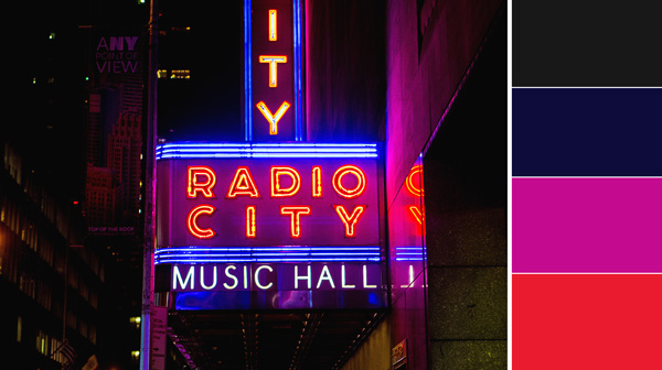
A high contrast website color scheme is a great way to direct readers' eyes through your website. Having a contrasting palette will allow you to highlight the key points of your website by using a pop color that stands out above all the other colors.
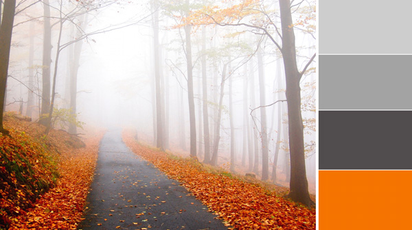
Keeps things professional, while also picking a palette that is fun and modern. Grays are neutral tones that compliment any color, having some grey in your website will set you up for any color combination you choose for your professional color scheme.
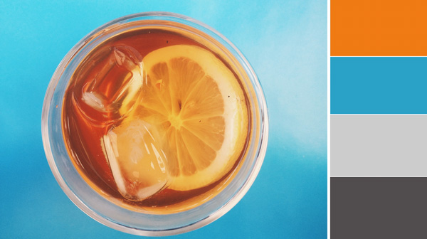
A color scheme that has one POP color paired with neutral colors is an easy way to build a dynamic palette in less than a few minutes. Neutral colors offer a professional look, by adding one bright color like cyan or a punchy pink you can have a sleek yet playful website that is bound to impress.
Having an impressive website color scheme will keep viewers on the page, as well as aid to the branding of your site and the business you've worked so hard to build. If you're not sure if the colors on your site are hurting your site's overall performance, let OCG Creative check it out. Our Reno web design and internet marketing team can help make your site more impactful and effective.