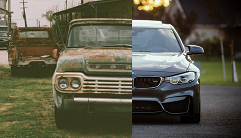
Designing a website is a lot like buying a car, you want the car to be fast, attractive and affordable, as well as being just the perfect shade of race car red, while also accommodating your need to impress everyone by having all the latest gadgets and gizmos. I am no car expert, but I do have a few knowledgeable pointers for anyone designing a website. Web design, just like everything else, creates new trends every year (I think to keep people on their toes), but really to improve on last years trends that were successful or to replace things that had as much success as Pokemon Go. 
This will drive the reader's attention to the places you want to focus on the most, it also adds a great deal to the design. Typography is all about hierarchy the largest fonts are read first and the smaller fonts are read after. Make sure your headlines POP. When reading a website, I'm sure you will agree, you're looking for specific information and when that information isn't easy to find, or read, you'll move on.
Nothing turns people off faster than an unattractive and hard to read font. Pick fonts that aren't over crowding, preferably a Sans Serif, also pick fonts that have the option of being bold and light and everything in between. It's easy to play with fonts when there are more options to choose from.
While, script fonts are elegant and provide visual interest, they are very hard to read. There are very few applications where script fonts are a can do, wedding invitations and tattoos, web design is not the place for a beautiful script font that no one can read.
The quality of images can really make or break a site. Web sites are marketing engines; however, if you have images that make your business look bad, your marketing efforts won't be as successful. Invest a little bit of time and money into taking images that really portray all the awesome things your company offers and does. High quality images will greatly highlight the content of your site and most importantly, keep the reader's attention longer. Images are great tools to help break up the content of a site and give people time to digest what they have just read.
If your website isn't responsive or mobile-friendly, you are loosing viewers. People always have their mobile devices with them and very few people sit at a computer just to surf the web. By making the conversion to a responsive website design, you'll have the potential to grow your traffic and help your business grow. So make the switch, web designers everywhere will thank you.
Just like with glue, less is more. An over designed website is overwhelming and hard to read, and often times, slow loading. Looking at a screen is already hard on our eyeballs, we shouldn't be adding to that pain by cramming a whole bunch of content, images and colored backgrounds into one hard to read monster. Creating negative space in a design will not only help reader's eyes, it will also help the overall design of your website. I want everyone to be aware that “award winning websites” often utilize the theory of negative space. So lets hop on the wagon and maybe we'll win some awards!
Sliders were the next big thing in web design, but what people don't understand is that sliders and carousels are very distracting to readers because sliders often times continue to loop after you have already moved on to the next section in a website.
A typical viewer scrolls past a slider without even seeing the second slide; meaning all of your efforts have gone to waste anyways. Sliders and carousels add to slow load times for websites, and are ultimately a downfall rather than a benefit.