The best creative web design for clients all have one thing in common; image quality. Images are the number one visual way information is communicated and in the day and age of increasing demands for quick information, images do a great job at telling a story quickly for site visitors. Images are crucial for efficient web design because they break up content on pages which can be overwhelming for visitors. Essentially, people want information fast, and when they don’t get the answer to a search phrase, they leave the site (contributing to high bounce rates, low conversions, and lowered SEO scores). What better way to convey information quickly than through pertinent images paired with good keyword-heavy content aiming to match a visitor’s search phrase?
Efficient use of images can be hugely beneficial to a site and can add to a business’s branding, their tone toward visitors, their business’s image, efficiency in converting visitors, guiding efficient site-navigation, SEO, and much more. Images work hand in hand with creative web design and are increasingly recognized in their importance in conveying information:
“A common finding is an observed processing superiority of pictures as compared to words, suggesting that pictures have a faster and more direct access to meaning, while words are discussed to require additional translational activity...” -Schlochtermeier, et al. (2013).
Given the importance of images to visitors, it is good to know what constitutes as good images for a website to make the most of creative web design.
When people think of the best web design they typically only think of a site’s layout. However, most people forget that a large portion of layout is where to place high-quality images and content. The best web design is unique for each client and their business. However, there are similarities with site layouts and how images are arranged:
Simple and effective designs use layouts with images that do not confuse visitors, help them navigate the site, sell your unique message, and help convert visitors into a customers. Good layouts also use images to guide visitors toward pertinent pages or locations on their site.
There is a misconception that images need to be small for a website. Images need to be as big as possible to get high resolution, only their file sizes need to be small. Thankfully OCG takes care of all file compression so even if you give us massive photos, we ensure they are optimized on your website. Images that are too small are 'pixelated' or 'low-res' and look bad on websites and can hurt your online appearance and brand identity.

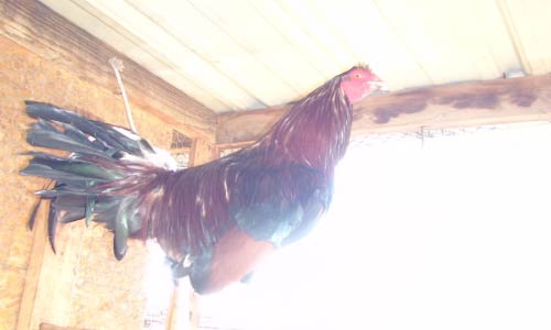
High Res Image

Low Res Image
The images need to be well lit. Avoid using a flash because it tends to wash out all images. The main source of lighting should not be behind the subject either and you should avoid highly contrasted images that add a lot of distracting patterns. This is very important because many images on a website have text over them and high-contrast images make it difficult to read the content and can be strenuous to look at on their own.

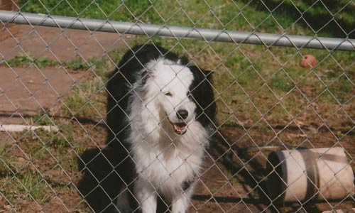
Good Lighting
Bad Lighting
Having everything in focus can make the image too cluttered and distract from what you really want to viewer to see in the image. A ‘soft-focus’ pulls the viewer’s eye toward the object you want site visitors to pay attention to while softly blurring the rest. This can also help de-clutter busy images.

Good Focus

Bad Focus
Many people think that if you want to draw attention to something it needs to be centered in the image. That can get repetitive with many images on your site. Take images from close up and far away with the subject in different places. It can be a mistake to take all of your images from one perspective using one composition, unless you are taking product shots.

Good Composition
Bad Composition
You may hear web-designers or account-coordinators talking about ‘mastheads’. Mastheads, banners, or site headers are the images that display at the top of each web page. These images need to be large (to work with a responsive website) and need to be ‘landscape’ not ‘portrait’. Additionally, because visitors only see a tiny part of the whole image, it is a good idea for the image to capture 'depth’. For example, instead of taking images from a top-down angle on a subject, try taking shots from different angles that emphasize perspective. A good way to do this is taking a series of images starting from the ground-level and moving up.

Good Perspective

Bad Perspective
Many clients find sites and ask what we can do to make their site more like the example they choose. The most common site people tend to ask for is Apple or other sites for technology companies. So what do they do that makes their layout work so well?
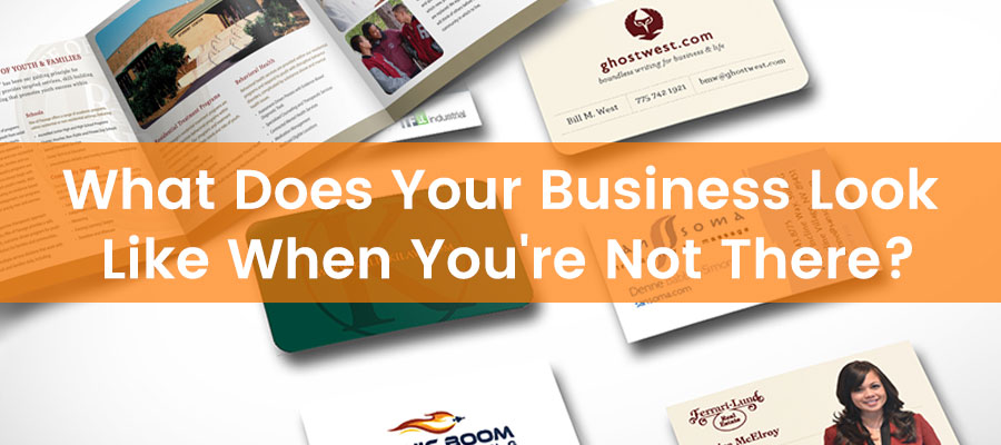 You did it! You finally opened that business you’ve been talking about for years. Now what? It’s the perfect time to make a great first impression. Often times businesses overlook the importance of the little things--business cards, flyers, brochures, posters, signs and the impact print marketing materials can have on the business. Think of what a great impression you make in person when sharing your excitement about your business. Now think about what your business looks like when you’re not there to represent it. Do your business cards leave a lasting impression like your meetings do? Does the post card you send out or the flyer you hand out look as professional and hip as your company really is? Taking time to create print collateral that represents your company image is as important as paying the electric bill. If your potential clients aren’t attracted to your print marketing pieces, then you’ve missed the mark.
Print them in bulk and hand them out like candy. If you’re making excuses for your business cards, it’s time to rethink your approach. Add spot UV to a silk finish for a great looking, great feeling card.
Pick an uncommon size. If it looks like all the rest, it will get lumped with all the rest. Stand out! Try a square brochure or one with rounded corners.
Print on both sides and make sure to use lots of stunning photos and color. Black letters on neon yellow paper should be used for yard sales and school projects.
Having a retractable banner is handy to set up at trade shows, networking events and impromptu sponsorship opportunities. Create a visually spectacular banner with company info and be ready to dazzle any crowd. Hanging banners can be powerful as well and come in a variety of sizes: from small table banners to building banners that are temporary signs. Regardless of the size, make sure the presentation and message are well thought out.
Mail boxes get bombarded with junk mail. Make sure your mailer looks a cut above the rest and doesn’t get hidden behind all of the #10 envelopes. Find a size that stands out in the clutter and focus on eye-catching graphics and simple, powerful messaging.
The best signs are the ones that can be seen and read from long distances. Don’t clutter a sign with unnecessary info or graphics. Choose colors and lettering that that are easy to read any time of day. Your print collateral serves as your marketing, your lead generation tool, and represents your company brand. It also paves the way for your future efforts: website, social media, email marketing and internet marketing. So, take the time and effort to make sure that all of your collateral represents your business in the way you would in person. Are you a new business? OCG Creative can print all of your business collateral with a fast turn around. If it has a surface, we can brand it! We have curated many print marketing materials for a multitude of clients both locally and nationally. Contact us to learn more.
With over 15 years of print experience, Charles Driver, Print Manager of OCG Creative, weighs in on the importance of having quality print marketing materials that represent your brand in a professional light. I have to admit that I’m a bit of a printing snob. Whenever I visit a local place in Reno, the first thing I do is take a look at the print marketing pieces they have lying around. Whether it’s business cards, brochures, or menus—a few things instantly pop into my mind. I can usually tell a company’s marketing budget and how much importance they put on their branding just by looking at their print collateral.
First off, does the piece look like it was created in a bootlegged copy of some office writing program? It’s very easy to tell when a talented designer had a hand in a particular design. You may not even realize it, but behind the scenes, your brain is making assumptions about the design. Subconscious lines are being drawn and everything is measured against a Fibonacci sequence. Go ahead, give yourself credit, you know good design when you see it. It’s colorful, vibrant and draws your eye in just the right path across the surface of the material. A poor design, on the other hand, consists of a basic border around the page, a begrudging splash of color, and generic fonts—looking at you Times New Roman. Poor aesthetic sends a clear message: we spent no time designing this piece. How is this going to represent your business? At the end of the day, it pays to invest in a good graphic designer.
Let’s be honest, glossy paper has been out of fashion for a long time. Just like a car immediately depreciates in value when you drive it off the lot, so does any marketing piece printed on gloss. It loses its luster as soon you pick it up from the printer. Fingerprints and high glare are unattractive in the hands of your target audience. Choosing a matte dull paper type is classy, looks good in all lighting conditions, and leaves room for accents. Want to add a kick? Go heavy, everyone has basic printer paper laying around somewhere but there are other tiers to consider between basic and card stock. Handing out flyers? Try something in a 28lb. Giving out menus? 80lb book makes the presentation a tactile feast and prevents images from bleeding through on the other side.
A trend that is not entirely new, but certainly gaining more traction is using a spot UV coating to highlight certain elements of a printed piece. Spot UV simply means selective gloss coating, and a good designer will offer plenty of unique ways to use it. After discovering this option in printing a few years ago, I’m now seeing this subtle, yet enticing accent in everything I purchase, from merchandise boxes to book covers. While I do see Spot UV enjoying its time in the sun for many more years to come, if you want to get ahead of the curve try a satin or silk coating. If paper type can be considered a tactile feast, then you’ve just been invited to a fancy dinner with steak and lobster when you use satin or silk. While they’re still considered a matte finish, these two coatings have a striking visual quality that is matched only by how they feel in your hands. These pieces demand to be taken home. In the end, design is the first and possibly the most important step in your printing journey. What your piece says about you right now decides whether it gets tossed in the bin or hung on the fridge. Designing your piece for print should be a collaborative and engaging process. The design itself should speak to the overall purpose of that piece. If I’m wandering through your establishment, I’m certainly looking and making judgements about your brand.
Learn more about the printing services that OCG Creative can offer,