In today’s digital landscape, how quickly a webpage loads plays a significant role not only in user satisfaction but also in how that site ranks on Google. From my experience in the business world, I’ve seen firsthand that slow-loading websites drive potential customers away before they even see what you offer. This delay affects bounce rates and ultimately impacts search engine rankings, making speed a critical factor for any business aiming to be competitive online. Prioritizing fast load times makes your website more appealing to both visitors and search engines alike.
Page load time influences SEO rankings more directly than many businesses realize. Google’s algorithm assesses how swiftly a page loads after a user clicks a link, rewarding faster sites with improved rankings. A slow page causes users to leave quickly, increasing bounce rates and signaling to search engines that the site may deliver a poor experience. When a page loads efficiently, it encourages visitors to stay longer and explore, improving engagement metrics that search engines use to evaluate your site’s value. This connection between speed and SEO means that slow websites face a disadvantage when competing for visibility online.
Speed also affects conversion rates, which are vital to any business website's success. Studies show that eCommerce sites loading within two seconds enjoy three times higher conversion rates than those slower than that. The importance of this goes beyond convenience—speed directly translates into revenue potential. When visitors have to wait, they are less likely to complete actions such as signing up, purchasing, or making inquiries. Hence, optimizing page load time is essential for both search performance and business outcomes.

Research shows users overwhelmingly prefer web pages that load quickly and present content simply rather than pages packed with heavy animations, videos, and large files that slow down performance. Fast, clean designs help users find information easily without frustration caused by delays. The less time a page takes to load, the more likely visitors are to engage positively with the brand behind it. This preference isn’t about sacrificing quality; it’s about respecting users’ time and making their experience smooth.
Even though visually rich sites may seem appealing, complex designs often contribute to longer load times and higher abandonment rates. Users want access to content without waiting unnecessarily or dealing with glitches caused by excessive design elements. Prioritizing speed aligns your website with user expectations and improves your chances of retaining visitors longer, which benefits SEO and builds brand credibility. Simplified design coupled with fast loading times offers the best path to engagement and search ranking success.
For businesses focused on local markets like Reno SEO, catering to user preferences by delivering fast and straightforward web experiences strengthens your brand’s competitive edge. Visitors expect easy navigation and quick access to relevant content, reinforcing the value of speed as a strategic priority.
Many businesses neglect to consider that a significant portion of users still access the internet on 3G connections or slower, especially when mobile browsing is involved. Designing with the assumption of high-speed broadband can lead to unnecessarily heavy websites that alienate users with slower connections. Planning your web design and content delivery around a 3G experience ensures your site remains accessible and functional for a wider audience.
Optimizing images, reducing file sizes, and minimizing unnecessary scripts are practical steps to improve load times on limited bandwidth connections. Testing your website performance on 3G speeds reveals challenges some users face and provides insight into how to streamline your site. This approach not only improves user satisfaction but also helps with SEO since search engines increasingly evaluate mobile performance as part of their ranking criteria.
By focusing on optimization for lower-speed connections, businesses demonstrate inclusivity and responsiveness to the actual conditions their clients experience. This mindset shifts priorities towards speed and usability, which are critical to maintaining engagement and strong SEO positioning in Reno and beyond.
There is little benefit to complex website designs if they negatively impact load times. Visitors tend to abandon sites that load slowly or display improperly, regardless of how visually impressive the design may be. Complexity often requires extensive resources to render pages, which can overwhelm browsers, especially on mobile devices or slower connections, resulting in broken layouts or functionality issues.
Moreover, complex sites are difficult to maintain and update, which can lead to inconsistencies and technical problems that harm SEO over time. When search engines crawl these sites, slow loading and errors reduce crawl efficiency and hinder the site’s ability to rank well. Simplifying design elements not only enhances performance but also makes ongoing site management easier and more effective.
Choosing speed and user experience over flashy design is a strategic decision that benefits SEO and visitor retention. Businesses that embrace simplicity avoid common pitfalls and align better with search engine priorities and user expectations, ultimately supporting stronger online visibility and growth.
Understanding how page load speed influences Google rankings provides a valuable perspective for any business owner or staff seeking an edge in Reno SEO. Fast-loading pages improve user engagement, reduce bounce rates, and align with Google’s focus on quality user experiences. Prioritizing speed over heavy animations or overly complex designs enhances site metrics that search engines favor, making your website more competitive.
Designing with realistic internet speeds in mind ensures your site is accessible and functional for diverse users, supporting broader reach and improved rankings. Keeping your website simple, fast, and easy to maintain benefits both your customers and your SEO strategy. Transitioning your mindset to value speed as seriously as content can create a meaningful advantage in today’s online market.
For businesses looking to optimize SEO results and deliver better user experiences, focusing on page speed is a powerful step. At OCG Creative LLC, we design websites that prioritize speed and usability first, helping you connect more effectively with your audience and achieve stronger search rankings in Reno.
In today's digital landscape, the importance of a robust, eye-catching, and functional website cannot be overstated. For small and medium-sized businesses looking to create a memorable online presence, your website acts as your digital handshake with potential clients. Where should one start when considering a website overhaul or a fresh design? Enter OCG Creative, a titan in the field of web design and digital marketing.
OCG Creative’s Unique Approach
Before the advent of the internet, businesses thrived on personal connections, understanding client needs, and tailoring services to fit those needs. OCG Creative brings that personal touch to the digital realm. They don’t just whip up a website. They dive deep, taking time to learn the intricacies of your business, your industry's nature, and the goals you're striving for.
The experience isn’t just about creating a website; it's about forging a partnership. The team at OCG ensures that from the moment you decide to work with them, your experience is not just efficient but enjoyable. Working with a dynamic team of designers and digital marketing professionals, they bring fun and functionality together.
The WordPress Advantage
So, why does OCG Creative swear by WordPress? WordPress is no longer just a platform for bloggers. It's the powerhouse behind a staggering 41% of the web. Its popularity isn’t coincidental. WordPress boasts scalability, meaning as your business grows, your website can too. It promises security, ensuring your data and your client’s data remain protected. Furthermore, its portability is unmatched. Unlike other platforms, a WordPress site isn't tethered to one host. Should you wish to move your digital space, WordPress allows a seamless transition without starting from scratch.
Mobile-Friendly Design: Seamless and Responsive
In an era where smartphones are virtually an extension of ourselves, ensuring your website looks impeccable on every device is non-negotiable. OCG Creative understands this. Every website they craft is designed to be viewed from any device, whether it’s a desktop, tablet, iPhone, Android, or any other device in between. This responsiveness ensures that your business is portrayed in the best light, regardless of how a client chooses to access your site.
Unpacking OCG’s Plans and Pricing
Value for money is a term often thrown around, but with OCG Creative, it’s a commitment. Their packages, starting with the Bare Essentials plan and going up to the Premium Essential, offer a plethora of features, from a foundational 5-page website to extensive SEO and social media services. What's more, each year-long contract comes with the promise of a complimentary website. Their tiered approach ensures businesses of any size, and budget can find a package that’s the perfect fit.
The Power of SEO and Digital Marketing
SEO (Search Engine Optimization) has become a buzzword in the business sphere, and for a good reason. OCG Creative harnesses the power of SEO to elevate your online visibility. They don’t stop there. Understanding that the digital marketing landscape is vast and varied, OCG offers services that span from email marketing, social media, advanced analytics, and even lesser-known gems like marketing automation.
To navigate the intricacies of the digital world, a business requires a seasoned guide. OCG Creative positions itself as that guide. Their cross-channel marketing strategies ensure that your business doesn’t just find its voice online but that it resonates, loud and clear.
As the digital realm continues to expand and evolve, having a strong ally by your side is paramount. OCG Creative, with its blend of expertise, dedication, and cutting-edge strategies, is poised to be that ally. Whether you're a startup or an established enterprise, remember that in the vast world of the web, your website is your beacon. Make sure it shines the brightest.
In the digital realm, the first page of Google search results is often considered a holy grail for businesses seeking online visibility. Such was the aspiration of Reno Pro Services, a company offering a comprehensive array of professional furniture services. The challenge? The digital sphere is crowded, making visibility a steep mountain to climb. However, they chose not to navigate this complex landscape alone – they turned to the experts at OCG Creative, and the rest is an SEO success story.
In today's bustling online marketplace, standing out from the crowd is no easy feat. Reno Pro Services recognized that a robust digital presence was critical for growth. However, capturing the attention of potential customers amidst a sea of competitors was an uphill battle. The mission was clear: to increase their website's visibility, drive more organic traffic, and ultimately, convert this traffic into loyal customers.
OCG Creative accepted the challenge with a clear plan: to leverage SEO best practices and transform Reno Pro Services from an invisible entity into an invaluable service provider in the eyes of search engines and customers. The agency identified keywords relevant to the client's business that held the potential to drive meaningful traffic and conversions. In this example, we will focus on the 5 following keywords:
"Furniture assembly reno"
"Reno furniture relocation"
"Furniture repair reno"
"Furniture assembly and repair reno"
"Reno commercial furniture installation"
OCG Creative's SEO approach was both technical and creative. They curated keyword-optimized content, focusing on relevancy, engagement, and quality. The agency also built high-quality backlinks from authoritative websites, boosting Reno Pro Services' domain authority. Additionally, they meticulously crafted metadata to ensure that every webpage communicated effectively with search engines. This blend of techniques ensured that the website was not only search engine friendly but also compelling and intuitive for its visitors.

The impact of OCG Creative's work was nothing short of transformative. Their expert strategies propelled the targeted keywords from obscurity to prominence. "Furniture assembly reno," initially with zero ranking, saw a significant rise in just a few months. "Reno furniture relocation" experienced similar success, climbing from zero to an impressive ranking of 48. This pattern of exponential growth was mirrored across all the targeted keywords, cementing Reno Pro Services' robust online presence.
OCG Creative's contribution to Reno Pro Services went beyond mere SEO. They played a crucial role in shaping their client's marketing strategies. Through their consultancy, they provided insights into customer behavior, identified market trends, and advised on effective promotional strategies. Their expertise enabled Reno Pro Services to refine their marketing efforts and establish a strong brand presence.
Furthermore, the agency ensured the website remained updated, user-friendly, and secure through regular maintenance. By prioritizing the site's health, they not only improved user experience but also furthered the SEO efforts, as search engines favor well-maintained, user-friendly sites.
The collaboration between Reno Pro Services and OCG Creative is a tale of digital transformation. By leveraging advanced SEO strategies, comprehensive marketing consulting, and continuous website maintenance, OCG Creative transformed their client's digital landscape. This case underscores the power of effective SEO, the role of an expert digital marketing agency, and the profound impact they can have on a business's online visibility. Whether you're a business owner seeking to enhance your digital footprint, a prospective client of OCG Creative, or a reader fascinated by digital marketing triumphs, this success story offers compelling insights and inspiration. Come to the Reno SEO experts for all your digital marketing needs.
There are literally thousands of ways to ruin a website. A website can be beautiful, perfectly branded and use all the latest browser technology—and yet still suck in a profusion of ways. Let’s examine a few favorites.
Topping the list is a website that’s too slow to load. Not only will your slow loading website turn away visitors at a rate of about 12% for every second you make them wait—you’ll also be signaling search engines that your website offers a poor user experience. As a rule, a bad user experience equals bad rankings.
Next up, your website has to be mobile friendly. All major search engines place priority on a website’s mobile experience over the desktop. And for good reason. Over two thirds of online searches are mobile. Desktops don’t even make up the remaining third.
Coming in at number three—hard to find contact info. There’s no point putting time and energy into the perfect web experience if your website visitors can’t figure out how to contact you. Put contact info on every page, and encourage users to reach out to you using whatever method they prefer. Forcing visitors to fill out a web form might just force them to look for somewhere else to do business.
Perhaps more important than being easy to contact is giving your visitors a reason to contact you. Not providing enough information on your website encourages your visitors to continue doing research. In the end, they’ll probably choose a competitor that provides lots of details about their company and the products and services they offer.
Finally, it is impossible to overstate the importance of organic search engine rankings. Search engine optimization, or SEO, is the process of making your website content the best candidate for coveted top spots in Google among others. Earning the number one position for the right keywords is a competitive advantage you can’t achieve any other way.
To recap, your website should;
 Who is Gary Vaynerchuk?
Starting as a born entrepreneur, Gary Vaynerchuk has been a part of many businesses throughout his career. He started as most kids do selling lemonade and then brought his business skills to the schoolyard. Through his high school career, he managed to sell tens of thousands worth of baseball cards. If you are suddenly thinking you spent your high school days wrong, you’re not the only one! Finally, as he moves from high school business, he starts to build his father’s local wine business into an electronic empire. With this expansion of the business, he decided to expand in the video industry and did a long series on youtube, the WineLibraryTV. As he spoke more he became more well known. He moved up in his career, focusing his books on media, communication, and marketing. Obviously what he was doing was working, he started another business with his younger brother. Making VaynerMedia a flourishing business today with over 800 employees. Not only is Mr. Vaynerchuk an exceptional businessman, but he also is known for his writing and public speaking skills. He has written 5 best selling books about business and can give valuable advice on the internet marketing industry. 
When you find the right platform/platforms to start internet marketing, you also have to provide the right content. Make sure it fits the platform and gets the message you want to send across. Giving the right content will have your target market interacting more frequently with your business.
Knowing your market goes across all business criteria. However, you have to know your target demographic when marketing online. You should know which social media platform they are spending most of their time on. This way you can create the perfect stories that match this platform.
No matter which platform you are using, you should give quality information and content to your viewers. Give them what they are asking for because they will want to spend time interacting with your site. Once they feel comfortable with your brand and company this is when it is acceptable to ask for their business. Know since you are giving your customers a lot, there is no need to feel guilty about asking for customers.
To learn more about internet marketing techniques, read about other internet marketing experts that OCG Creative has provided.
![]()
Picking colors may seem like an easy chore that can be done in five seconds, right? Wrong, picking a great and impactful color scheme requires some planning and thought to how well the colors work together.
“Colors must fit together as pieces in a puzzle or cogs in a wheel.” - Hans Hofmann
To help you with your own palette, I've put together examples of website color schemes, to take for inspiration, as well as a few things to think about when you go to pick your website's color scheme.
Using warm colors with cooler ones will create a complimentary color scheme that is bound to impress viewers whether you choose a deep blue and bright orange, or a dark purple and vibrant yellow. Something to write down so you'll remember is, warmer colors are going to pop more than cooler colors, so you'll want to make the highlights and features of your site the warmer color of your palette.
Purples, blues, grays and sometimes green.
Yellows, oranges, pinks and sometimes green.
Forest green is a cool color, and lime green is a warm color.
Keeping things simple is always a good thing when it comes to building website color schemes. Using tints and shades of two colors will add dimension to your website's design while keeping a minimalistic look that won't overwhelm readers.

A high contrast website color scheme is a great way to direct readers' eyes through your website. Having a contrasting palette will allow you to highlight the key points of your website by using a pop color that stands out above all the other colors.
Keeps things professional, while also picking a palette that is fun and modern. Grays are neutral tones that compliment any color, having some grey in your website will set you up for any color combination you choose for your professional color scheme.

A color scheme that has one POP color paired with neutral colors is an easy way to build a dynamic palette in less than a few minutes. Neutral colors offer a professional look, by adding one bright color like cyan or a punchy pink you can have a sleek yet playful website that is bound to impress.

Having an impressive website color scheme will keep viewers on the page, as well as aid to the branding of your site and the business you've worked so hard to build. If you're not sure if the colors on your site are hurting your site's overall performance, let OCG Creative check it out. Our Reno web design and internet marketing team can help make your site more impactful and effective.

The best creative web design for clients all have one thing in common; image quality. Images are the number one visual way information is communicated and in the day and age of increasing demands for quick information, images do a great job at telling a story quickly for site visitors. Images are crucial for efficient web design because they break up content on pages which can be overwhelming for visitors. Essentially, people want information fast, and when they don’t get the answer to a search phrase, they leave the site (contributing to high bounce rates, low conversions, and lowered SEO scores). What better way to convey information quickly than through pertinent images paired with good keyword-heavy content aiming to match a visitor’s search phrase?
Efficient use of images can be hugely beneficial to a site and can add to a business’s branding, their tone toward visitors, their business’s image, efficiency in converting visitors, guiding efficient site-navigation, SEO, and much more. Images work hand in hand with creative web design and are increasingly recognized in their importance in conveying information:
“A common finding is an observed processing superiority of pictures as compared to words, suggesting that pictures have a faster and more direct access to meaning, while words are discussed to require additional translational activity...” -Schlochtermeier, et al. (2013).
Given the importance of images to visitors, it is good to know what constitutes as good images for a website to make the most of creative web design.
When people think of the best web design they typically only think of a site’s layout. However, most people forget that a large portion of layout is where to place high-quality images and content. The best web design is unique for each client and their business. However, there are similarities with site layouts and how images are arranged:
Simple and effective designs use layouts with images that do not confuse visitors, help them navigate the site, sell your unique message, and help convert visitors into a customers. Good layouts also use images to guide visitors toward pertinent pages or locations on their site.
There is a misconception that images need to be small for a website. Images need to be as big as possible to get high resolution, only their file sizes need to be small. Thankfully OCG takes care of all file compression so even if you give us massive photos, we ensure they are optimized on your website. Images that are too small are 'pixelated' or 'low-res' and look bad on websites and can hurt your online appearance and brand identity.

High Res Image

Low Res Image
The images need to be well lit. Avoid using a flash because it tends to wash out all images. The main source of lighting should not be behind the subject either and you should avoid highly contrasted images that add a lot of distracting patterns. This is very important because many images on a website have text over them and high-contrast images make it difficult to read the content and can be strenuous to look at on their own.

Good Lighting

Bad Lighting
Having everything in focus can make the image too cluttered and distract from what you really want to viewer to see in the image. A ‘soft-focus’ pulls the viewer’s eye toward the object you want site visitors to pay attention to while softly blurring the rest. This can also help de-clutter busy images.

Good Focus

Bad Focus
Many people think that if you want to draw attention to something it needs to be centered in the image. That can get repetitive with many images on your site. Take images from close up and far away with the subject in different places. It can be a mistake to take all of your images from one perspective using one composition, unless you are taking product shots.

Good Composition

Bad Composition
You may hear web-designers or account-coordinators talking about ‘mastheads’. Mastheads, banners, or site headers are the images that display at the top of each web page. These images need to be large (to work with a responsive website) and need to be ‘landscape’ not ‘portrait’. Additionally, because visitors only see a tiny part of the whole image, it is a good idea for the image to capture 'depth’. For example, instead of taking images from a top-down angle on a subject, try taking shots from different angles that emphasize perspective. A good way to do this is taking a series of images starting from the ground-level and moving up.

Good Perspective

Bad Perspective
Many clients find sites and ask what we can do to make their site more like the example they choose. The most common site people tend to ask for is Apple or other sites for technology companies. So what do they do that makes their layout work so well?
Designing a website is a lot like buying a car, you want the car to be fast, attractive and affordable, as well as being just the perfect shade of race car red, while also accommodating your need to impress everyone by having all the latest gadgets and gizmos. I am no car expert, but I do have a few knowledgeable pointers for anyone designing a website. Web design, just like everything else, creates new trends every year (I think to keep people on their toes), but really to improve on last years trends that were successful or to replace things that had as much success as Pokemon Go. 
This will drive the reader's attention to the places you want to focus on the most, it also adds a great deal to the design. Typography is all about hierarchy the largest fonts are read first and the smaller fonts are read after. Make sure your headlines POP. When reading a website, I'm sure you will agree, you're looking for specific information and when that information isn't easy to find, or read, you'll move on.
Nothing turns people off faster than an unattractive and hard to read font. Pick fonts that aren't over crowding, preferably a Sans Serif, also pick fonts that have the option of being bold and light and everything in between. It's easy to play with fonts when there are more options to choose from.
While, script fonts are elegant and provide visual interest, they are very hard to read. There are very few applications where script fonts are a can do, wedding invitations and tattoos, web design is not the place for a beautiful script font that no one can read.
The quality of images can really make or break a site. Web sites are marketing engines; however, if you have images that make your business look bad, your marketing efforts won't be as successful. Invest a little bit of time and money into taking images that really portray all the awesome things your company offers and does. High quality images will greatly highlight the content of your site and most importantly, keep the reader's attention longer. Images are great tools to help break up the content of a site and give people time to digest what they have just read.
If your website isn't responsive or mobile-friendly, you are loosing viewers. People always have their mobile devices with them and very few people sit at a computer just to surf the web. By making the conversion to a responsive website design, you'll have the potential to grow your traffic and help your business grow. So make the switch, web designers everywhere will thank you.
Just like with glue, less is more. An over designed website is overwhelming and hard to read, and often times, slow loading. Looking at a screen is already hard on our eyeballs, we shouldn't be adding to that pain by cramming a whole bunch of content, images and colored backgrounds into one hard to read monster. Creating negative space in a design will not only help reader's eyes, it will also help the overall design of your website. I want everyone to be aware that “award winning websites” often utilize the theory of negative space. So lets hop on the wagon and maybe we'll win some awards!
Sliders were the next big thing in web design, but what people don't understand is that sliders and carousels are very distracting to readers because sliders often times continue to loop after you have already moved on to the next section in a website.
A typical viewer scrolls past a slider without even seeing the second slide; meaning all of your efforts have gone to waste anyways. Sliders and carousels add to slow load times for websites, and are ultimately a downfall rather than a benefit.
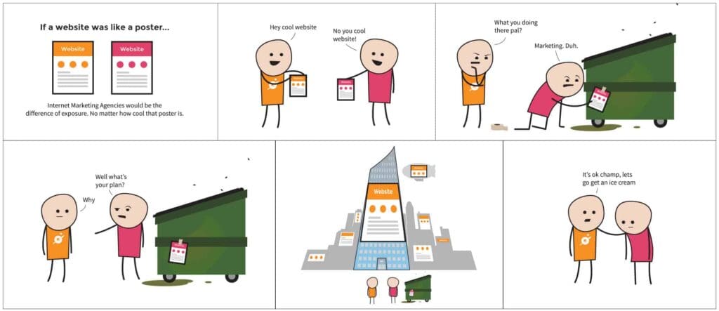
Creativity reigns supreme right? It is common knowledge that only the coolest websites get top exposure. Part of me, as a web designer, hopes this would be true. However, creative web design only takes a business so far. Ultimately, there are thousands of terribly designed websites that get more traffic than award-winners. If you want your website to work for you beyond a cocktail party talking point, then you need to know that Web Design is a part of Internet Marketing and not the same thing.
As cleverly explained by the cartoon, you can have the most creative and interesting website in the world, but if you market it horribly, then not many people will see it and you won’t get a very good return on your investment. OCG Creative’s team of dedicated and nerdy Reno web designers and developers work hard to produce these award winning sites. We have done this for numerous clients for many years. Part of the creative web design also involves the user’s experience with the website, which is why an analogy of a website being a poster is only part-true. In reality, a website is a fluid document – it changes with input from the user and looks different on different devices. OCG works to build the coolest website imaginable for our clients, but we know at the end of the day that it is essential to market it correctly, and websites should never stop when the design is completed.
As a secret confession, I used to wonder this question all the time. There are plenty of online tools to build a website, and before I became a web designer, I even built my own portfolio using one of these tools. The issue with all of them… they’re awful. Even discounting the fact that all of them stop at the end of web design, the web design itself is clunky, confusing, and very limiting. I didn’t realize this until I experienced it first hand. A website should never stop at the end of creative web design. Instead, it should be a rocket-powered branding piece pushing the client forward to more exposure and spurring the start of a comprehensive effort to convert website visits into leads. OCG custom designs each website so it is beautiful and branded, but most importantly, they are scalable and sturdy for expansion in traffic and tailored to convert site visitors into customers.
After website design is completed, many people stop and never touch it again. It’s similar to making a cool poster and then never posting it anywhere. Why? Internet marketing takes effort, DIY site builders don’t have the resources to market each site created and the sites themselves are cluttered and reject efforts to market them. A lot of this is due to lack of on-site SEO support in addition to other elements such as effective landing pages and lack of Conversion Rate Optimization. It is much easier to stop after finishing the web design part.
The point is, OCG Creative is a dedicated and experienced Reno web design and internet marketing agency that has the resources. Websites should be built to be optimized for internet marketing. The issue with DIY site builders, is the website's inability to integrate with a meaningful and comprehensive marketing campaign for individual clients. This is because DIY sites purposefully exclude any means of integrating with an internet marketing plan, it is simply too much effort for DIY site builders to accommodate these features. Internet marketing takes time and a sturdy website foundation specifically built for internet marketing. Additionally DIY site builders don't want to manage campaigns because they take time and constant tuning. Hard work with SEO, Landing Pages, CRO, and other services, take time to gain traction. OCG maintains these campaigns, constantly tailoring our client’s Internet Marketing plans to coincide with optimal conversions including tracking page visits and valued keywords to get them ranking higher. You can’t get that level of detailed attention with do-it-yourself websites. It takes significant time, specialized data collection, and informed decisions to be implemented after data collection to market a website correctly.
If you’re not sure where to go from here knowing all of this or if you still think an awesome looking website is the most important thing for you or your business, give us a call or browse our other topics. We’ve been doing this for a while and know the internet marketing world front and back.
 If you want to start an email campaign for your business, you might be tempted to buy a list of leads. Before you do that, I would suggest something even better, and that's building an organic list from your website. Why? Building your email list organically ensures that your leads will actually want to hear from you. It will result in less opt-outs and getting marked as spam. If you get marked as spam too many times, you run the risk of being "blacklisted" or blocked from email servers. If you're new to this, do not fear. You can build your own list through website lead generation.
Lead generation online consists of building a list of qualified individuals who are interested in your products or services. You can collect this information through forms and calls to action (CTA) on your website. How do you get visitors to fill out forms? Offer something of value. People will exchange their contact information for something that benefits them or sparks their interest. At minimum, you want to collect a name and email address. However, for more extensive offers, you can ask for a mailing address and phone number. Make sure you don't ask for too much information upfront, as it will cause people to bounce off the page. Are you ready to start building your email list? Here are a few different campaigns you can use to start generating leads on your website:
Is your business taking advantage of offering discounts online? Now, this may seem like a no-brainer, but sometimes the best way to get somebody to initiate contact is through an old-fashioned freebie. Giving an attractive discount, free sample, or trial offer can attract leads that otherwise would have kept on clicking. How to do it: Incorporate a free offer or discount into a landing page, pay-per-click ad, or social media ad. Make sure you pick one goal for the user and focus your landing page around that. Learn more about landing pages here.
To blog or not to blog, that is the question. When you blog for your businesses, you create the opportunity to attract new leads by positioning yourself as a thought leader in your industry. You can also position yourself as an expert by creating educational videos, downloadable guides, white-papers and E-books. Offering exclusive content is a great way to build your list and generate leads. How to do it: Integrate a sign up form with your content offer at the end of a blog post or on a landing page. Blog posts are great because your audience is already reading your material and might want more information. Having trouble coming up with content? Read our tips on overcoming writer's block.
You know you love the camera. If not, that’s okay. You can still host an online class or webinar via podcast or voiceover. Do it live or send out recorded sessions—the choice is yours. There’s endless options for connecting with potential leads all over the world now, and turning your office into a virtual classroom. How to do it: Develop your content and promote your class via a landing page that can be shared through ads, social media or on your website. People will exchange their contact info in exchange for the free class. If it’s good enough, it may convert them to a customer! Alright, I have to go do some online shopping. And my coffee is cold. Cue the end of this blog post. Thanks for reading and check back for more marketing tips and lead generation ideas!
If you’ve been brushing up on your web terminology, you may have heard the term “landing page” floating around. What is that exactly? In the marketing world, a landing page refers to a web page designed with one specific purpose in mind: to convert visitors into leads.
Let’s take a minute and break this down into simple terms. These pages solely exists to get visitors (i.e. the people visiting your site) to perform a specific action like filling out a form or clicking a call-to-action. By completing this action, you are able to collect important information about this person or direct them further into the sales funnel. Once you have their information, they became a “lead” that you can add to your database of potential customers.
If you’ve ever been enticed to sign up for an e-book or free sample, there’s a good chance you were lead without even realizing it. A well-designed landing page will persuade you to exchange your contact information for an attractive offer, such as a discount code or newsletter. Basic design elements combined with the right page layout can also help boost your conversion rate.
As mentioned above, these pages help guide visitors toward completing an intended action on a website. By definition, a landing page should not have global navigation linking back to your main website. This keeps visitors from clicking off the page and getting distracted from the main conversion goal. To learn more about how landing pages are used, check out our previous blog post.
Landing pages come in two basic forms: lead generation landing pages, which direct you to fill out a form and click-through landing pages which direct you to another page. Both types are important and serve different purposes to maximize conversions. It does no good to place random forms or buttons all over your website in hopes that people will click them. Instead, placing these strategically on a landing page statistically leads to better conversions. Thanks for reading! We love hearing from you. If you have more questions about landing pages or Reno web design, contact OCG Creative.
Last month I conducted an email survey asking one simple question: Given the choice, which of the following is more important for your business website? There were only two possible answers: Your website's design, or search engine rankings. Here are the results:
Although the survey was unscientific, the results show that website owners clearly understand the importance of search engine rankings. With few exceptions, I believe search engine rankings are the most urgent factor contributing to business website success. Simply put, if people can't find you, it really doesn't matter how great your website looks. That's not to say website design isn't important. It's vital. However, it is easy to get wrapped up in design and put everything else on hold. Here, we design around search. By that, I mean literally putting ranking factors above design elements and publishing content around specific search terms. We predict visitor volume based on specific keyword rankings and known search volumes. Our goals for design are to provide an elegant, polished, branded experience for users that is lightening fast on any device. That happens to be Google's goal too, so favor is being given to sites that meet these criteria. In many ways, I think it's time to rethink design. In the old days, the goal was to keep the total weight of a webpage under 100K. Even better, under 65K. As broadband became widespread, that kind of went out the window, although I personally never bought into the idea that a page could be as big as you want. With something like 2/3 of Internet searches being conducted on mobile devices, that 100K limit makes a lot of sense. So, while web design is critical, it is important to keep things in perspective. Rankings and user experience are what drive sales. Design complexity is fun, but frequently stands in the way of other critical goals.