Without any other information, your potential customers will assume better businesses have better business cards. Chances are you don't give business cards much thought, but you should. Let's start with a story. About five years ago, we met a newly minted physical therapist. At the time, he was fresh out of physical therapy school and ready to blaze a path helping people get back into daily living. He had (still has) all the skill and personality to make a big difference for a lot of people, but first they would need to know he existed, let alone available to see patients. He chose to work independently through an office that housed several physical therapists, each competing for whatever patients would walk in. In order to avoid bias, the receptionist would direct visitors to a grouping of a dozen or so, you guessed it, business cards. We've been advocates of great business card design for decades, but this one physical therapist's experience sums up how important business card design really is. Right out of school, budget was a major concern, but we convinced him even expensive business cards are cheap--especially if it's your only form of marketing. In the end, I think 1,000 cards cost him maybe $150, plus a little bit of design time. Altogether, he probably paid about a quarter a card for that first order. That's quite a bit when you consider some places will sell you a thousand business cards for $25. That cost difference translates to a lot of ramen noodles, which is an important consideration at the early stage of any career.

Before I skip to the end of the story, let me introduce you to the concept of opportunity cost. Opportunity cost is the future pain you inflict on yourself, measured in dollars, for being unable or unwilling to make a good decision today. In this case, the good decision was to invest an extra $125 in business cards that made him look awesome compared to the competing therapists. From the very first day, he crushed them. Literally, all of the patients that walked in the door chose him over the others. Today, he has his own thriving practice, to which, he gives significant credit to the early boost he got by dominating his competitors with business cards. The opportunity cost would be to exchange all of that for $125 he'd have blown on noodles.
For starters, going low-tech shouldn't be lame. Your business card should feel like a gift. Don't laugh. Your card can be that cool. Let's break it down.

Graphic design for business cards is, in some ways, secondary to other elements like paper selection and coatings. However, aside from pure gold, no coating will ever make up a bad design. The moral here is to have a pro design your card. Even if you spend a few hundred bucks, you'll only spend it once, and a good designer will make you look like you are a market leader. Color and typography must be perfect. Graphics must be unique and tack sharp, and your logo... ...your logo has to be (a) a logo, and (b) support your brand. In a future post, I'll detail all the ways business owners sabotage their brand with crappy logos, but that's a topic for another day. Let's assume your logo is perfect.
As I mentioned earlier, even expensive business cards are cheap. Not coincidentally, OCG Creative is leading marketing agency for the scuba diving industry. Same for musical instruments and adventure travel. We target these because we have direct history and personal expertise, which gives us a huge advantage over agencies that need to learn from scratch.

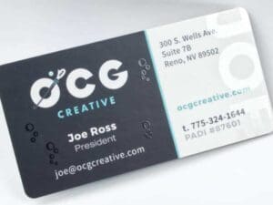
The boost in visibility that provides to our clients in those industries is a really big deal. In order to underscore that, we have designed specialized business cards specific to each industry. Pictured is the card I use when working with scuba resorts, diving equipment manufacturers and retailers. We exhibit at a diving industry trade show (DEMA Show) every year. Having my PADI instructor number printed on the card provides credibility, while the specialized branding helps identify us as the obvious choice for scuba-related businesses seeking a marketing agency. If your business targets a specific industry, this specialized approach can be very powerful--especially if you belong to trade organizations or offer additional expertise.
Business cards don't have to be made of heavy paper, but they probably should. While a card can be fashioned from metal, plastic, leather, bamboo or even chocolate, these materials can be difficult to handle in some business settings. These can also run a few dollars a card and be challenging to re-order. So, while I've seen some incredibly cool cards made from surprising materials, these can be impractical and unnecessarily expensive. There are many different papers available for business cards. In general, heavier cards have a richer feel, and standard, smooth papers provide the most options for ink choices and special coatings.
Matte Dull offers a clean, modern look and is glare-free. This style works great with subdued designs and color palettes and will often look cleaner as fingerprints won't show. It is also a great choice if you plan to write on your business cards.
Not only do glossy business cards look great, but they are longlasting and durable. Cards with a glossy finish stand out and have a longer lifetime. A gloss can also help preserve bright colors and photos included on your cards.
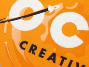
Spot UV adds selective glossiness over targeted portions of your card. This style can be added to logos, text, graphics or images to add contrast or highlights. Against a matte background, your logo will stand out with Spot UV.
Silk is a beautiful finish that has a tactile feel and presence you have to see and touch to believe. A laminate coating is placed over the top of each business card for an elegant and modern appearance. Silk business cards are water resistant, highly durable and great for accenting bright pops of color. You can also write on these business cards.
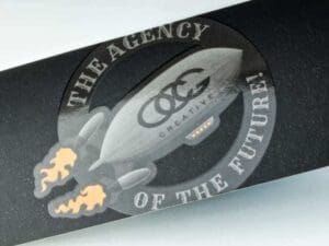
Silk with Spot UV is the ultimate way to leave a long lasting impression. Spot UV will accent your silk finish, accentuating your logo or any other element of your card. For a distinguished flare, this style will bring your business cards to the next level of professionalism.
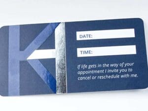
Rounded corners can be applied to any printing and coating options. Smoothed out corners add a subtle, but impressive touch. Other unconventional designs, such as odd-shaped cards or squared cards can also give your business a unique look.